Premiere was the most known German pay TV channel. Nowadays Sky Germany has over 5 million permanent subscribers.
Back to the roots of Neville Brody
Premiere Digital has been the most successful German pay TV broadcaster since 1997. It changed to Sky in 2009 and disappeared from the German and Austrian market. Shortly afterwards, Premiere AG was renamed to Sky Deutschland AG. In order to push the channel in a new direction, MetaDesign decided in 2007 to adapt the branding that was originally created by Neville Brody in the 90s. This naturally meant that all on air design elements had to be redesigned. As an approach for me, that also meant finding a new look & feel that puts the brand back in the foreground and that is visually unique in the world of television.
The new minimalism and purism of pay TV
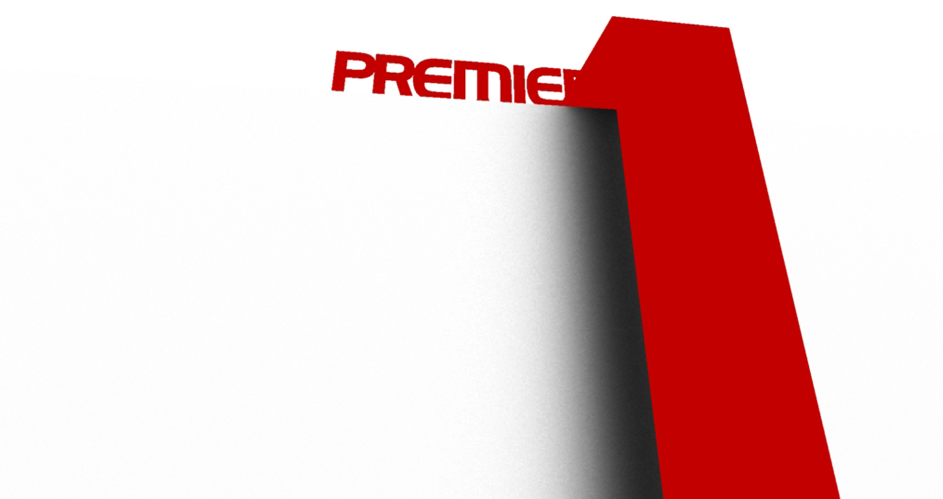
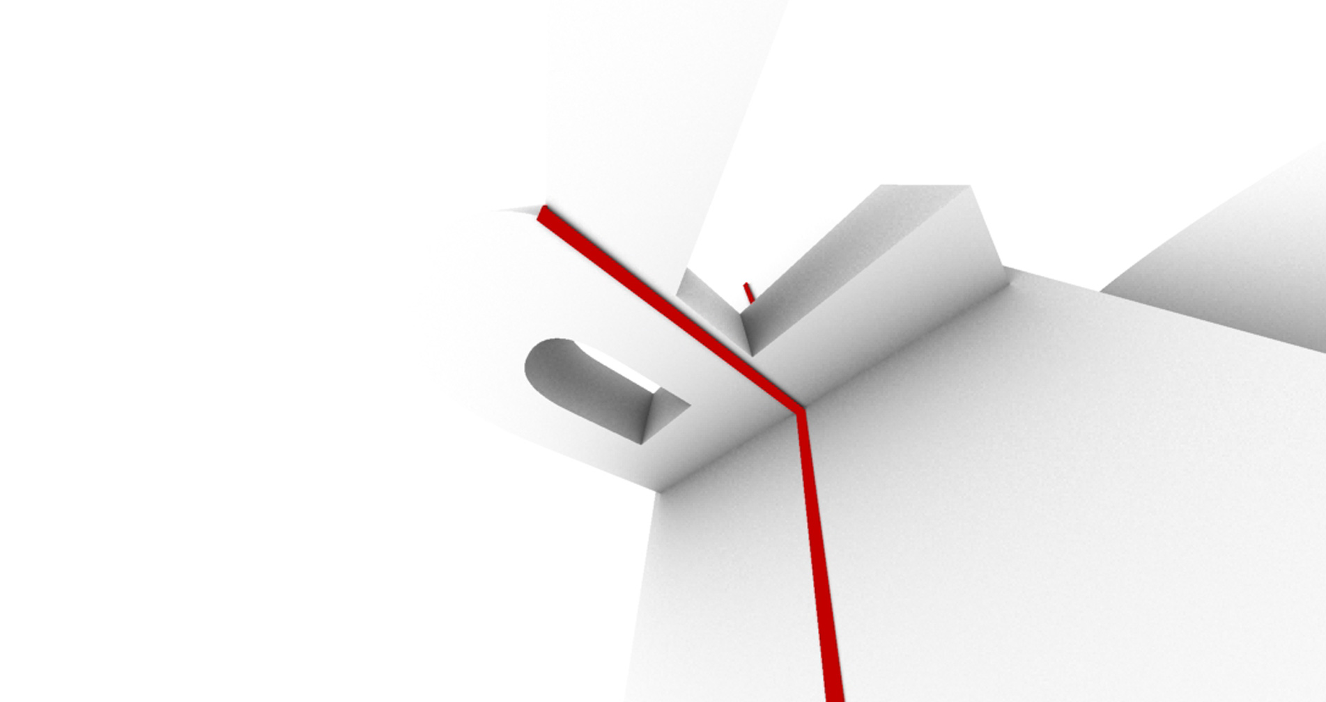
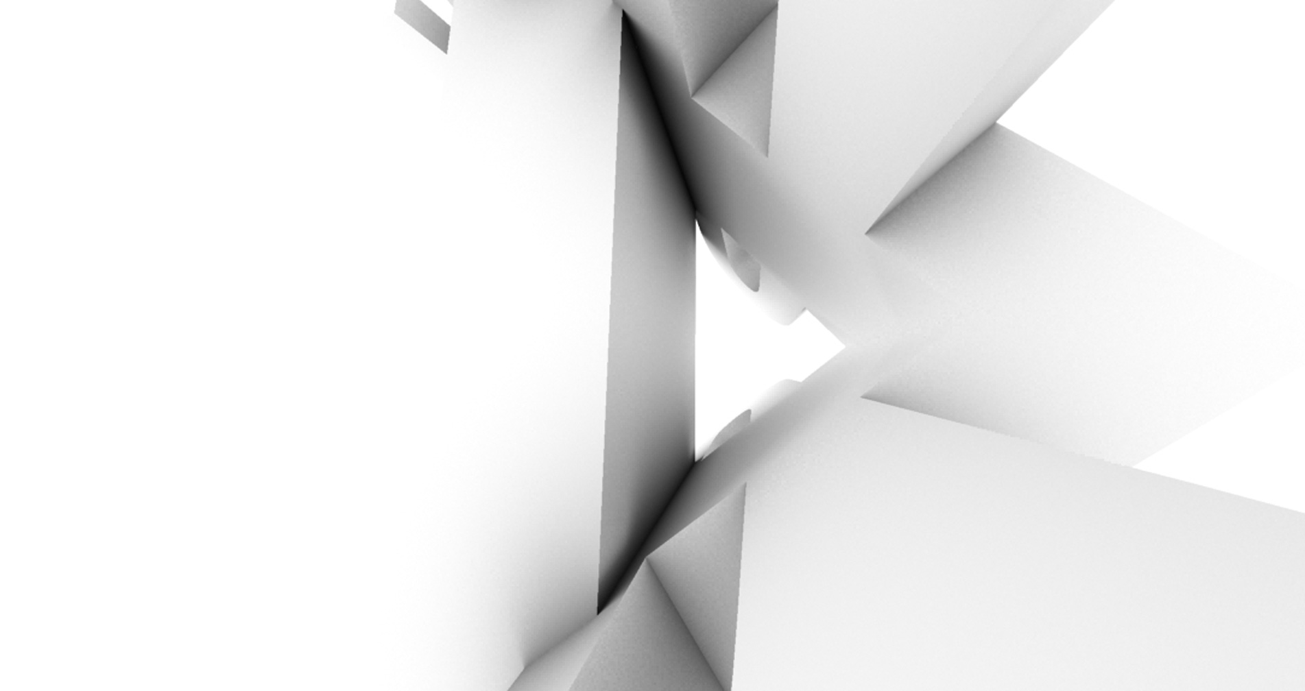
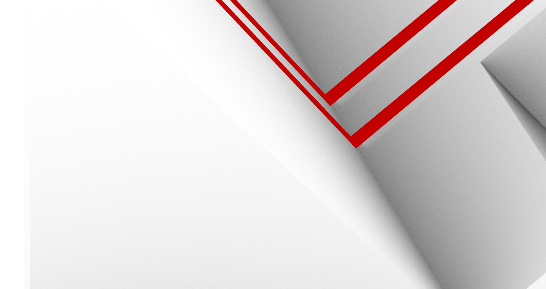
For the umbrella brand, this meant a very minimalist and puristic approach. No dark 3D worlds with reflections and lens flares anymore, but still an abstract, bright world, which can only be seen in a few shadow movements. Coloured accents give easily an orientation and use the color coding of the sub-brands. A kind of metallic tape runs through this world and guides the viewer.
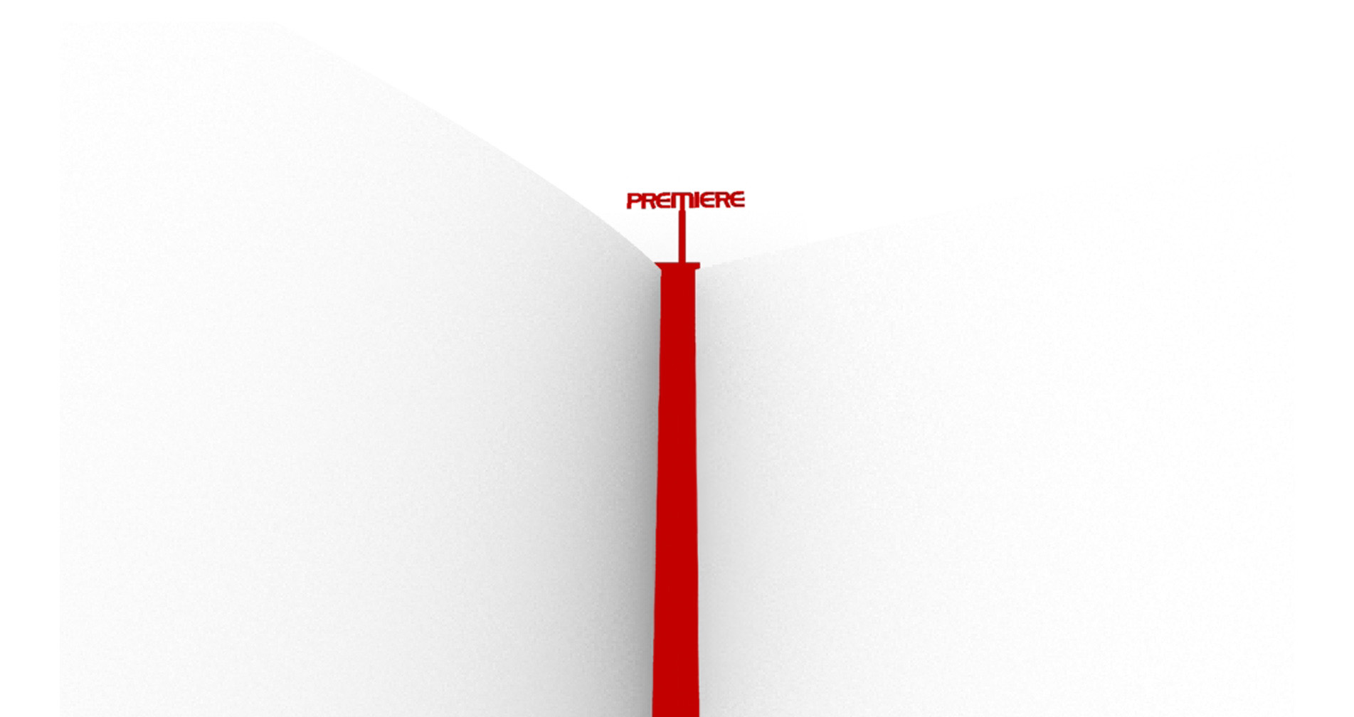
Atmospheric and calm instead of bold
This new Premiere world has no up and down and no gravity. The laws of physics are overridden. And so one can discover the world of Premiere in the fullest. The bright environment makes the brand stand out in its strong red and forms the end of the path. The visual level is rounded off by an atmospheric sound design. No pushy rock music jingles anymore. The on air elements are much more impressive in a calm way and make a significant break to the usual TV program.
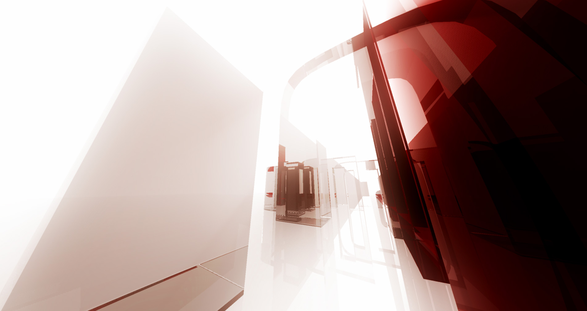
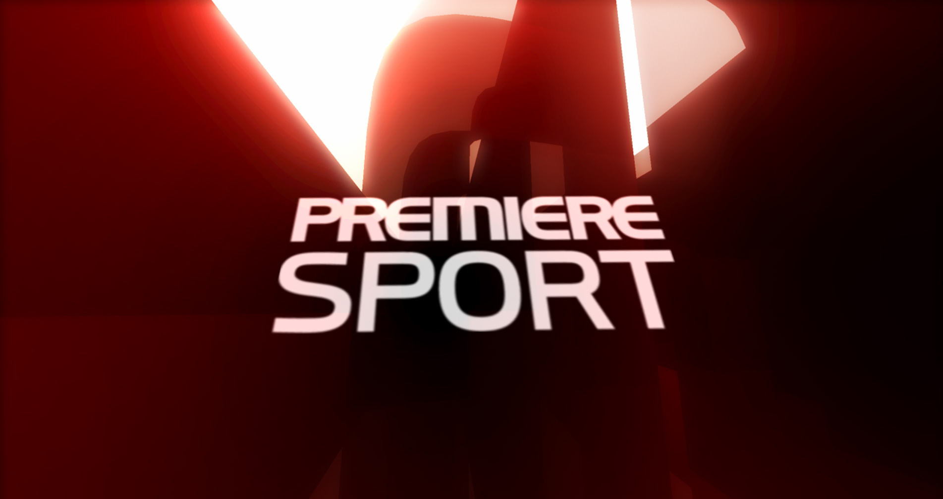
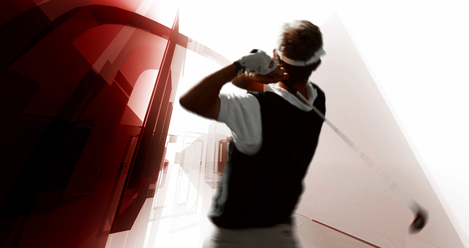
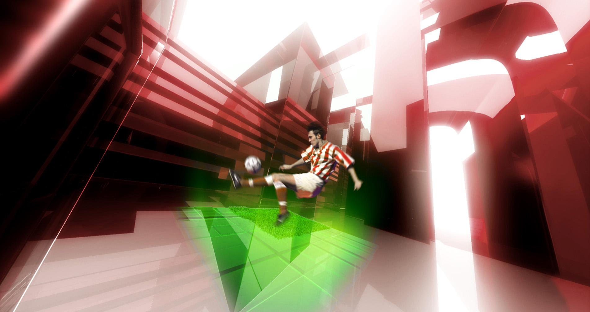
The everchanging, transforming world of Premiere Sports
Of course, the Premiere sports channel also got its facelift. Here, however, the channel marketing didn't want to focus on minimalism, but rather to stage continous movement and action. A world in constant motion. In this world, sports is of great presence in an atmosphere of overcoming gravity. In a strong, all-reflected red, this world shines like a glass labyrinth, which is defined by the movements of the athletes and constantly realigned to new shapes that finally form the Premiere Sports logo.

The world of Premiere has no up and down and no gravity. The laws of physics are overridden.
On air design as a symbolic forecast
Although it was not foreseeable at this time that Premiere would become a part of Sky, the on air design did very well to skilfully incorporate into the glass and colour-accented design of Sky. What then seemed to fit economically in 2009 was already taken into account in 2007 in terms of design.